Identity systems
Finding a central idea, then testing how a mark and its supporting elements can remain coherent across different formats.
Independent design space / Identity & visual direction
Exploring how simple forms, expressive type and considered colour become a recognisable visual language.
Explore the thinking ↘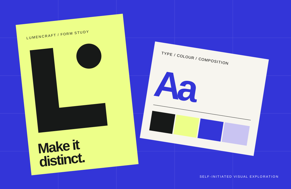
Clarity before decoration
One strong mark is only a beginning. A visual identity becomes useful when its typography, imagery, colour and spacing speak the same language, from a small label to a full page.
Lumencraft is an independent concept and design research project. The examples shown here are original visual studies, not commissioned client work.
Areas of exploration
Finding a central idea, then testing how a mark and its supporting elements can remain coherent across different formats.
Using hierarchy, pace and negative space to make information feel inviting and easy to navigate.
Translating a visual direction into an accessible web presence, with readable type, useful structure and deliberate details.
A working method
Open to a conversation
Questions about the project or its visual explorations?
emma.parker@lumencraft.no-ip.pl ↗